Wesleyan Launches Responsive Homepage
 Olivia Drake
Wesleyan has a new look online.
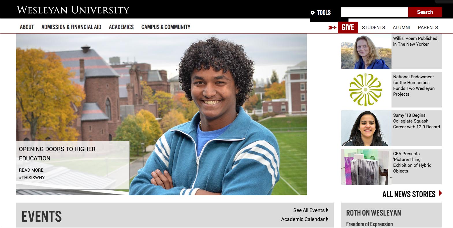
On Jan. 14, the Office of University Communications and Information Technology Services’ New Media Lab launched a new Wesleyan homepage and associated landing pages.
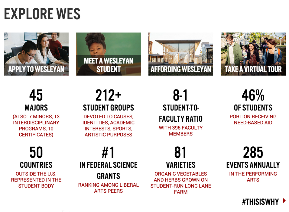
The new design features a photo-rich look with an abundance of newsy campus content up top. As users scroll down, they’ll see links to upcoming events, President Roth’s blog, an Exploring Wes section catered to prospective students, and several more links connecting users to Wesleyan resources, tools and social media. Content, overseen by University Communications, is updated multiple times a week.
“The new page reflects current industry standards in web design, and we hope it will be more engaging for users,” explained Bill Holder, director of University Communications. “We want to appeal to prospective students and and other off-campus audiences, but also provide information and a useful navigational structure for our campus community, based on patterns of usage we’ve observed for several years.”
Wesleyan faculty and staff will see that a number of popular destinations — including portfolio and several sites currently subsumed in portfolio — are available both through a “tools” button in the top bar and through an expanded set of links in the page footer. These navigational options will be available on all Wesleyan webpages. Wesleyan students and prospective students can browse the new About, Campus and Community, Students and Academics page, which includes links to every area of study.
“Our hope is that campus users will find that they can more easily reach a greater range of sought-after sites with these more robust navigational options,” said Melissa Datre, director of New Media Lab.
The homepage has been designed responsively, meaning that it adapts depending upon whether users are viewing it on desktops, tablets, smart phones or other mobile devices.
“We’ve been tackling new technology and learning as we go,” said Jen Carlstrom, lead designer in New Media Lab. “But having a responsive design is one of the biggest benefits of the new homepage.”
Wesleyan’s first webpage was launched in the early 1990s. This is Wesleyan’s fifth or sixth complete redesign.
“The World Wide Web changes so fast, and we’re always trying to keep up with it,” Carlstrom said.
Browse the new homepage at wesleyan.edu.
 Olivia Drake
 Steve Scarpa