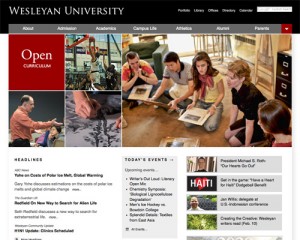
Wesleyan Homepage Featured in Design, Development Blog

Smashing Magazine, a web design and development blog, ran an article March 19 on higher education web sites, focusing on homepage design.
In part the text noted: “College and university websites have a lot of roles to fill. They need to provide information for prospective students (both new and transfer), parents of students and prospective students, current students, and alumni. In many cases, they’re also the gateway to the school’s intranet and the public face for both academics and athletics. They often need to include reams of information in a way that makes everything easy to find. It’s a huge challenge.
And the truth is: most college and university websites are horribly designed. Either they look like they were designed fifteen years ago and then forgotten about, or they’re so overloaded with information that it’s almost impossible to find what you’re looking for.”
The post offers screenshots of many university homepages, and very brief comments about each one. About Wesleyan’s homepage, the blog said, “Wesleyan University uses a grid layout and sophisticated color scheme.”
Many of the sites that the we considered when we redesigned the Wesleyan homepage are featured here. (Among my personal favorites are Dickinson, Middlebury, Syracuse, Oxford and Washtenaw.) Notably absent: MIT—one of the most influential university homepage designs. Here is the list of web sites that the Wesleyan web team consulted during our design process.
Check out the Web Updates Blog for more on the redesign of the Wesleyan homepage.
(Contributed by Adrian Cooke)

