Traveler’s Lab Creates Map of COVID-19 Cases in the NYC Commuting Region
In late March, as New York City’s coronavirus infection rate skyrocketed to five times higher than the rest of the country, members of Wesleyan’s Traveler’s Lab explored a movement-focused approach to the rapid spread of the disease.
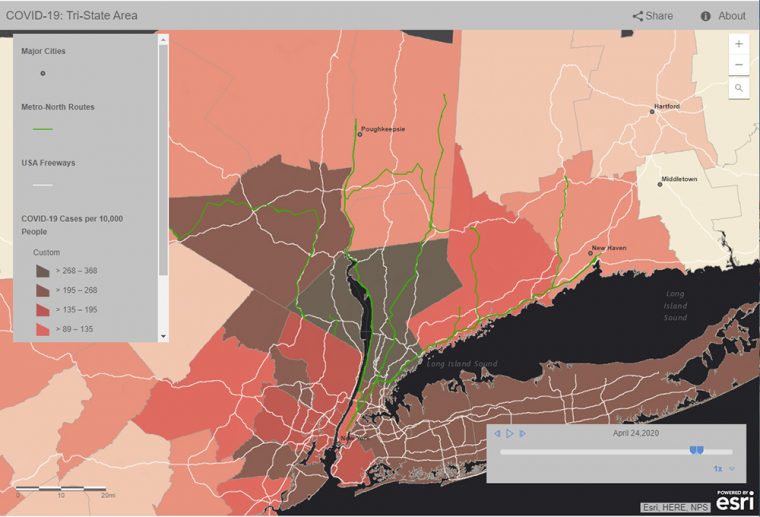
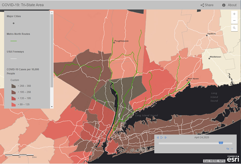
Rather than focusing on political borders, lab members depicted major freeways, highways, and commuter rail lines out of New York City, and examined counties within a 2.5-hour drive from the City.
“While New York City may be the center, it is the travel region immediately surrounding the city that provides the true context of how COVID-19 has spread and is spreading to, and from, the City,” said Traveler’s Lab manager Jesse Torgerson, assistant professor of letters. “Informed by geographic and historical methods, this approach provides a truer context for human interactions.”
On April 27, the lab released a time-enabled regional map titled “COVID-19 in the NYC Commuting Region.” Torgerson, Rachel Chung ’20, and Ezra Kohn ’20 collaborated on data collection, while Grant van Inwegen ’20, Jesse Simmons ’21, and Associate Professor of the Practice in Earth and Environmental Sciences Kim Diver focused on mapping using GIS software.
Chung, a government and economics major with a minor in applied data analysis, joined the Traveler’s Lab during the fall 2019 semester. Her interest in the lab is to explore how data analysis can be applied to fields not traditionally thought of as being particularly data-oriented, like medieval history.
“I’ve personally found our transition to remote collaboration quite smooth,” Chung said. “It greatly helps that everyone in my team is communicative and dedicated to their work!”
The lab’s geographic visualization of the spread of COVID-19 began with road and rail networks. Lab members overlaid official county-by-county data with confirmed COVID-19 cases.
The Traveler’s Lab map provides three aspects either unavailable or unclear in visualizations by others (such as the maps by Johns Hopkins University, University of Connecticut, and The New York Times):
- A time slider that represents the development of the crisis since March 1, 2020;
- Counties shaded by percentage of the population tested positive for COVID-19, rather than bubbles representing total case counts; and
- A demonstration of how this pandemic has actively spread along lines of travel rather than according to political boundaries.
All Traveler’s Lab research projects start with the premise that cities are never isolated, static collections of residents. While lab members usually study the movement of people and objects during the Middle Ages, they shifted their efforts for this project to study the movement of people to aid in the current day crisis.
“We hope that our visualization can contribute to enhancing the focus of collaborative efforts by making the interconnectedness of our localities evident, especially as we move into a period where regions begin considering how to ‘reopen,'” Torgerson said. “By presenting historic data rather than only live data, we also hope to provide our fellow residents the ability to maintain a historical perspective on how this situation has developed, and continues to develop.”
View the lab’s map and methodology in these posts made on April 27 and May 12.